There will be a number of improvements in the user interface in v2.2.
Descriptions in The Message Window
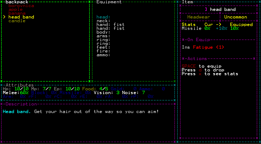
The little description panel that monsters and items have that describes them is very small. There is a lot of other information that needs to fit there. In previous versions I have even enlarged the entire panel, but still it’s not enough. Often descriptions are truncated and some flavour text is even missing. Well, I realized there’s a perfect solution that both makes more space in the target/item windows and allows much more space for textual descriptions. Look!
Since there is now so much space it also give me an opportunity to add things in the descriptions I didn’t previously have room for, as well as adding more flavour.
The drawback might be that you don’t see the latest messages while doing this. But I don’t feel that that is a problem as they are available as soon as you exit your inventory or examining a monster.
Clearer Alerts
The message window blinks whenever there’s a message that is more important to see. However, it can sometimes be hard to see which message was intended for the alert.
The alert now removes all other text, centers the message in the message window like this:
Better Prompt
Finally, the prompt previously asked you to press ‘y’ to confirm actions. This could be confusing, especially if you didn’t see it (any other keypress would cancel the action). It also forces you to move your hands from the default keys.
The prompt is now instead a menu in which you can select yes or no. It is harder to miss, and easier to use.
Less Clutter
Some new players have been complaining that TGGW is showing too much information. I can certainly understand how it is hard to filter out relevant information for a new player, but I still want to keep the mechanics completely transparent and visible. However, not all information is relevant at all times.
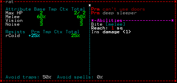
For example: a rat have 0% armour and 0% block, it resists only cold and have no other resistances and vulnerabilities, they don’t have a ranged attack and does not use magic points… so why show them? The game will now only display non-zero values when examining a monster for a much more focused overview:
This also helps in emphasizing a monsters abilities, strengths and weaknesses as it is less likely to “disappear” in the clutter. A related function is to semi-hide all attributes that are currently at zero for the player in the attributes panel. This should help the player to focus on what is important. I am consider to have this function optional though, not sure everyone would be happy with this.


The only thing I can comment on without just giving you the praise you deserve are the semi-hidden player attributes, which from the screenshot above I personally find ugly (though arguably useful, it’s really just my preference). If they are going to be optional, then I can only say: Waiting intensifies! 😀
And I really like you solution for monster attributes display, that’s a very elegant way of showing everything in a very clean way!
Yeah, I suspected maybe not everyone would find it aesthetic. Then I make it optional and add a few “looks” to it (it is really fast and easy to do). The dark blue is almost invisible, another option that looks ok is to just grey them out. And I would leave in the option to keep it like before as well.
I really like the monster attribute thing too! It was so simple I’m surprised I didn’t think about it before!
An idea: some small game statistics. Total number of games, number of wins. There could be a line for every level, and a number how many times i reached it, and a percentage. I’m curious about my win percentage 😀
Yes, this is something that would be really good and is quite easy to implement. I have planned to add statistics for a long time but for some reason haven’t got around to do.
I like that particular idea, it would be nice!
Maybe some kind of time element would be nice as well in the statistics. Maybe how the average deapth is changing.
Is it OK Iron staff and Heavy gauntlet can’t rust?
and one more idea: giving meta flavors and more goals to the player: like if you win two games in a row the gate to the surface goes into an other terrain. (actually i have never won twice in a row 😀 but im just playing a game where i have a chance now :))
That is also interesting!
Yes, when I get a statistics element in place it will be a lot of possible way to arrange data. We’ll see how it turns out when I get there 🙂
The heavy gauntlet is not made of iron (it’s unspecified) that’s why they don’t give an mp-penalty. The iron staff should rust yes, I’ll fix.
I will honestly say that the worst part of TGGW in my experience is the interface. Love The game but i dislike the interface. Its very raw (because of the lines).
But keep it up i love playing your RL.
Could you elaborate more on what you don’t like about the interface? I don’t quite get what you mean by “lines” or “raw”?
I will try :S
There are too many lines separating the boxes
Look at the first pic for instance, the backpack and the equipment boxes are separated by two lines… why when it could be only one line, you will be saving space. Again other boxes have more lines…
There are way too many lines indicating that the boxes are separated.
IDK whats the purpose of so much lines and what do they actually aid. Pretty much (precious) space is being wasted for these lines indicating something that other lines already indicated.
The lines itself are raw since they look unpolished on the command line. You probably cant do much here since its the CMD.
I mean no harm im just pointing out what i personally dont like. This is not a huge problem.
I hope i conveyed properly, im not an english speaker.
Thank you! I’m interested in all kinds of opinions 🙂
Yes it is hard to make something aesthetically pleasing in a console window. I’d rather have a fully graphical application of course. This is the route I took, partly because it was easy to get started and partly because it allows me to add a lot of content without making art for it.
I understand what you mean by the lines now. I actually like it with double lines, but of course your opinion may differ. Each box is surrounded by lines, even adjacent ones.
Thank you for your input!
Small bugs(?) about the map.
On this one there is an unreachable space(behind the green stair):
http://imgur.com/bdl4x67
This time i used a map scroll, and then I checked the map of the level. And the wall behind the merchant isn’t there. So I just guess it is a wall there 🙂
http://imgur.com/Zwmh6MB
Oh one more thing i fogot to add. I think something is wrong with poison. Now I had 95% poison immunity and 1 point of poison, and I died from 2 life, so i missed the 95% twice. And similar things had happened several times. Maybe I’m just unlucky, but it is kinda suspicious 🙂
Yes poison resistance is a bit… unintuitive. I plan to rework poison entirely in a later version.
Thank you! First bug is fixed in the next versions. For various reasons (this bug is one of them) I have decided to go back to the old stair system where stairs are in the middle of floors and you have to activate them.
For the second: Yes, it is a known bug in the mapping effect. It is quite low priority.