I have put a lot of effort in the user interface for TGGW since I really think that classical roguelikes suffer in this area. Traditionally most of the keyboard is used as a “command set” since roguelikes are generally known to have complex interactions. However, this tradition is now being broken by modern roguelikes. In my opinion, a simpler user interface does not have to make the game less interesting, slower to operate or even less complex. It has been discussed in the community quite a lot. An article by Darren Grey discusses how modern roguelikes can be designed. TGGW implements several of his ideas such as: cardinal movement, space as contextual action, easy inventory system, clarity of mechanics, tutorial, quick restarting and small levels.
Console games
TGGW takes inspiration from console games in its design. In particular I wanted the game to have such a simple interface so that no help screen or “list of commands” would be necessary. Instead, the game can be played using the arrow keys, space and the keys z,x and s. Some non-mandatory short-cuts can also be used.
Feedback
In roguelikes, the player can usually follow what happens in a text log. Often, reading the log is the only way to follow exactly what happens in the game, especially if the game has ASCII-graphics. In TGGW there is visual feedback so that the log does not have to be read. The feedback is implemented by colour coding and blinking characters. For instance, if you hit a monster and miss, a ‘/’ character will blink indicating a miss. If you hit, the number representing the damage you did will blink over it. Any effects also has their own visual feedback. In this way the player does not have to read the log to understand what is going on.
Menus
Menus are in my opinion one of the most logical and easy to understand mechanics for navigating in a game. It is widely used in RPGs for computers and console games, so why not for roguelikes? One criticism is that they are slow. But when all common actions are associated with a key, then I think it is fully acceptable to have the less common actions accessible through a menu. Actions such as resting or watching the map is accessible through menus in TGGW.
Inventory/Equipment

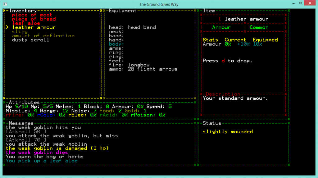
You can press space to equip the leather armour. The Item window shows how your stats are affected by equipping it. The equipment window highlights the slot that is going to be equipped.
Using items, equipping and unequipping, picking up and dropping is handled in a very simple manner. There is an inventory/equipment screen accessible by a key that lets the player select an item and press space. Space triggers the default action of the item (such as equip, consume, read, etc). Any non-standard action (such as dropping the item) is displayed in the item window along with the key to do it.
Lists
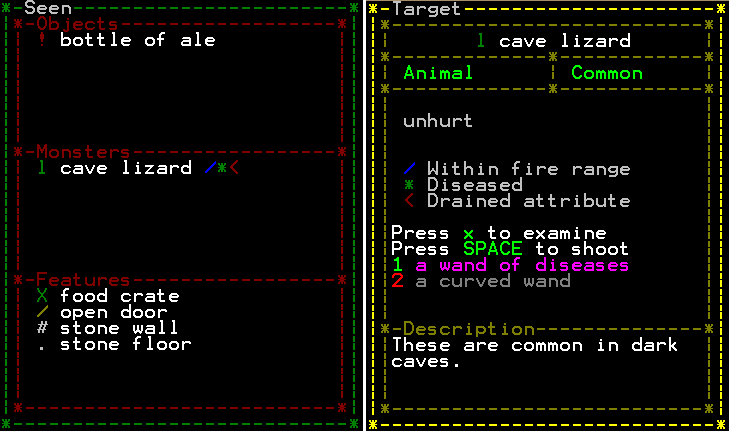
ASCII games have a problem, especially for players that are not used to ASCII “graphics”. The problem is that each symbol is representing something and unless you are used to the game, it is not easy to know what everything is. This can be solved by showing a list of characters to the player for quick reference. This idea is not new but greatly increases the clarity of the game.

You know, from what you posted, the game sounds really interesting. Can’t wait for release!
Thank you! This motivates me to hurry up 🙂