Release #6 is about ready, and I will now be entering a phase of testing. The release will be fairly minor compared to what they usually are. There are mostly bug fixes (including some unfortunate crash bugs introduced in Release #5), balancing and making the interface smoother. Some of the changes:
Inventory Management
As I wrote previously, I have tried to make inventory management better, especially when dealing with a full inventory. Since then I have also introduced some more features: when you pick up an item from the floor, the inventory cursor will move to it, so that when you enter the inventory the cursor will point to the last picked up item. In will also move the cursor of the inventory and equipment as you equip and unequip items for quicker access to what you are currently handling.
New Option for Unseen Areas
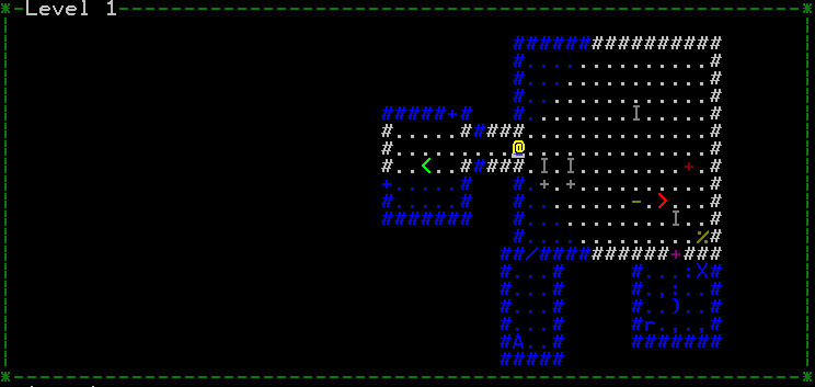
The unseen areas (that is, outside of your field of vision) of the map are slightly greyed out and sometimes it may be hard to see what is currently in your field of vision. I have now added an option for changing the colour of unexplored areas to make them more distinct. The default option is still to have it like it has been so far (I think that looks the best). You can choose between dark grey (default), blue or dark blue. The “blue” option would look like this:
Scrolling Messages
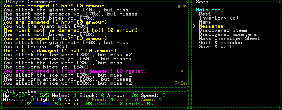
You can now (finally!) scroll the messages when you look at them from the menu.


